Are you ready to take your data plotting skills to the next level? In this exciting lecture, we will dive deeper into the art of creating eye-catching and informative plots. In the previous section, we explored the basics of plotting, but now we’re going to explore how to make our plots more sophisticated and visually appealing. Buckle up and get ready to unleash your creative side!
Contents
Adding Labels and Titles
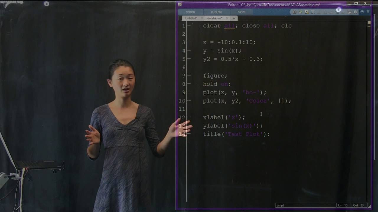
One of the first things we’ll explore is how to add labels to our plots. Labels are essential for providing context and clarity to your visualizations, making them accessible to anyone who views them. To label the x-axis, we’ll use the X label function, while the Y label function will allow us to label the y-axis. By specifying meaningful labels, we ensure that others can easily interpret and understand our plots. Additionally, we can add a title to our plot using the Title function, which will appear at the top of our visual masterpiece.
Plotting Multiple Functions Simultaneously
What if you want to visualize multiple functions on the same plot? No problem! With the power of Python, you can plot as many functions as your heart desires. Say we want to plot a line alongside our existing sine function. We can accomplish this by making use of the plot function twice, once for each function we want to display. However, there’s a catch! By default, calling the plot function multiple times will override the previous plot. But fear not, for we have a simple solution.
Keeping Multiple Plots on One Canvas
To keep multiple plots on a single canvas, we use the hold on command after creating the figure. This command tells the program to retain all existing plots and allow us to add new ones on top. Now, when we call the plot function for our line, it won’t erase our sine function. The result is a beautiful visualization where both functions coexist harmoniously, displaying their unique characteristics.
Enhancing Your Plot
Now that we’ve successfully plotted multiple functions together, let’s explore how we can make our plot even more visually appealing. Suppose our line is somewhat hard to distinguish from the sine function. To solve this, we can change the color of our line to make it stand out. With a wide range of predefined color shortcuts like red (R) and blue (B), the possibilities are endless. However, if you desire a specific color, you can specify the RGB values to create a customized shade. Experiment with different color combinations until you find the perfect match for your plot.
Moreover, if you feel like your line is too thin and needs to be more prominent, you can adjust its thickness using the line width parameter. By increasing the line width, you ensure that your important line won’t go unnoticed, grabbing the attention of anyone who lays eyes on it.
Creating a Clear Legend
With multiple functions plotted on one canvas, it’s crucial to provide a clear legend to distinguish between them. The legend function comes to the rescue, allowing us to assign labels to the different functions we plotted. By specifying the order in which we plotted the functions, the legend automatically assigns the corresponding labels. Now, anyone viewing our plot can easily identify the sine function and the line, thanks to the helpful legend.
This is just the tip of the iceberg when it comes to plotting and visualizing data. As you become more comfortable with these techniques, you can apply them to more complex data and create stunning visualizations with countless layers of information. So, go ahead and unleash your creativity, plot to your heart’s content, and let your data speak for itself!
To explore more fascinating topics in information technology and stay updated with the latest trends, visit Techal.
