Welcome back!
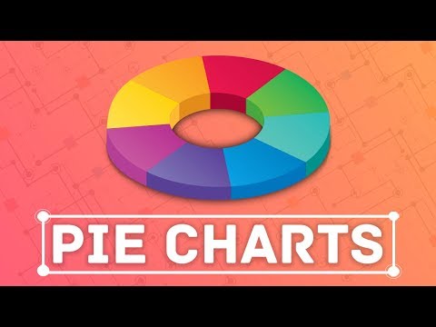
In this tutorial, we will explore how to create a pie chart in Tableau to showcase the proportion of reviews for each audiobook in our dashboard. Understanding the number of reviews is crucial for our analysis, as it helps us identify the most popular audiobooks in the marketplace. Alternatively, we can also use a pie chart to visualize the percentage of people who purchased a specific audiobook.
To get started, let’s add the “Rating” field to the workspace area. Since we want to calculate the total number of reviews, we will use the “Count” aggregation for this measure. The current sum of all ratings is 10,798 reviews, which we know to be true.
Next, we will add the “Audiobook Names” dimension above the ratings field to create a breakdown by audiobook. This will give us the precise data we need for our pie chart.
To create the pie chart, we can simply select the pie chart icon within the “Show me” functionality. Initially, the chart may appear small, but we can easily resize it by clicking anywhere in the workspace area and using the Control key along with the arrow keys. Pressing Control and Up will increase the chart’s size vertically, while Control and Right will increase its size horizontally. Conversely, Control and Down (or Control and Left) will decrease the chart’s size.
Now that we have our pie chart, it’s time to add labels to make it easier to interpret the data. By dragging the “Rating” field to the “Label” section, the number of reviews will be displayed next to each audiobook. Remember to use the “Count” of ratings, rather than the sum.
But how do we display these values as percentages? It’s simpler than you think. Go to “Analysis,” select “Percentage of,” and click on “Table.” Voila! Now we can see the percentage that each audiobook contributes to the total number of reviews.
Looking at our pie chart and the added labels, we can observe that Audiobooks 1 and 2 account for over 50% of the total number of reviews received by the company. This insight is truly fascinating, as it highlights the significance of these best-selling audiobooks in driving business success.
In our next lesson, we will create the third and final chart to complete our initial plan and build the dashboard we envisioned from the start.
Contents
FAQs
Q: Are pie charts the most effective way to visualize proportions in Tableau?
A: Pie charts are certainly a popular choice for displaying proportions, but their effectiveness depends on the specific dataset and context. Other visualizations like bar charts or stacked bar charts can also be suitable alternatives for showcasing proportions in Tableau.
Q: Can I customize the appearance of the pie chart in Tableau?
A: Absolutely! Tableau offers a range of customization options to enhance the look and feel of your pie chart. You can modify colors, add labels or tooltips, adjust the size, and even format the text to make your visualization more visually appealing and informative.
Q: Are there any limitations to using pie charts in Tableau?
A: While pie charts are useful for displaying proportions, it’s important to remember their limitations. Pie charts can become cluttered and difficult to interpret if you have too many categories or if the differences in proportions are minimal. It’s always a good practice to consider the context and purpose of your visualization before deciding on the best chart type.
Conclusion
In this tutorial, we learned how to create a pie chart in Tableau to represent the proportion of reviews for each audiobook. By visualizing this data, we gained valuable insights into the popularity of different audiobooks and their impact on the company’s success. Stay tuned for our next lesson, where we will complete our dashboard by adding the final chart. For more exciting tech content, visit Techal.
Remember, the world of data visualization is vast, and Tableau is just one of the many powerful tools at your disposal. Keep exploring and unlocking the potential of your data!